

Beadboard cabinets bring charm, texture, and a timeless feel to any home. Whether you’re designing a cozy cottage space, a fresh farmhouse, or a mid-century modern look, the right color combinations will transform your design from basic to beautiful.
If you’re working with custom-built cabinets or planning a full kitchen remodel, choosing the right color combination for your beadboard cabinetry ensures your space feels cohesive, welcoming, and true to your taste.
In this guide, we’ll discuss the best shades to pair with beadboard cabinets, helping you make the cabinets in your kitchen, bathroom, or other room feel polished and personal.
What are beadboard cabinets?
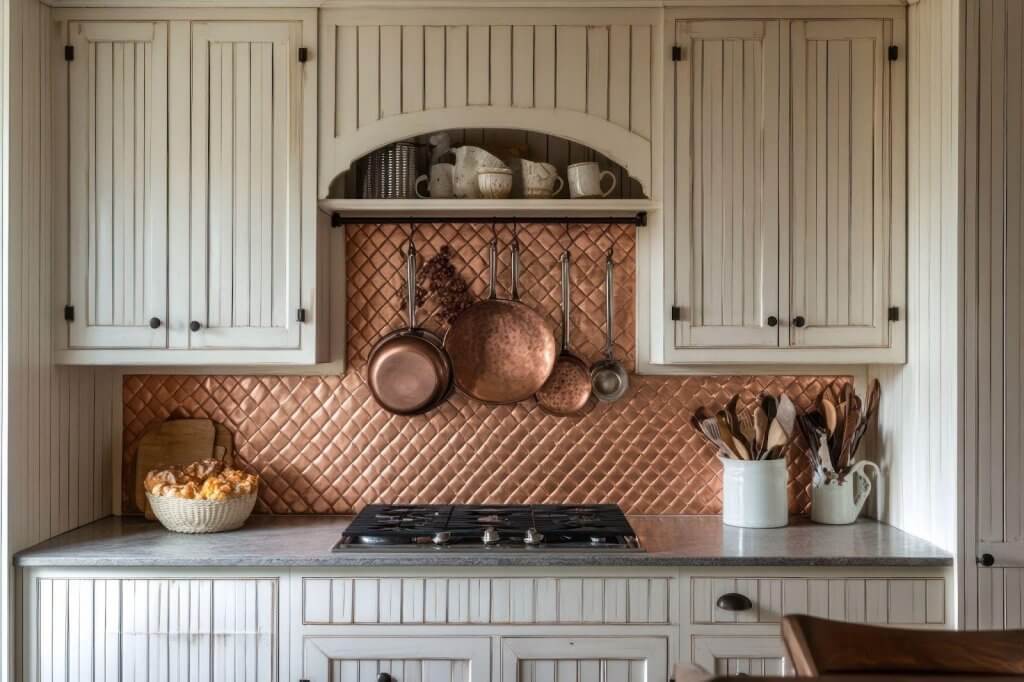
Beadboard cabinets feature vertical grooves that run along the face of each door or drawer. This paneling adds visual texture and a handcrafted feel that many homeowners love. Beadboard is originally found in country homes and seaside cottages and has made a strong comeback, blending classic style with modern finishes.
These cabinets often serve as a standout design element. Their pattern gives even the most subtle color a sense of depth. Whether painted, stained, or left natural, beadboard works well as custom-built cabinets that reflect your style and space.
HGTV suggests using beadboard for a casual lived-in feel or for a vintage vibe.
Why color choice matters for beadboard cabinets
Because beadboard cabinets have built-in texture, your color choice will highlight or soften that detail. Lighter tones brighten a room and make the grooves more noticeable, while darker hues create contrast and a dramatic feel.
Color also affects the overall tone of the kitchen. Warm whites are clean and welcoming, while navy or black add luxury and boldness. Since most bespoke cabinetry lasts for years, picking the right palette keeps your kitchen stylish and functional.
Understanding a bit of color theory will help guide your choices
Light colors like white, cream, and soft gray tend to reflect light, making small kitchens feel bigger and more open. These hues emphasize the vertical lines of beadboard, drawing the eye upward and giving the illusion of height.
Warm neutrals — such as beige, taupe, or light wood stains — create a cozy and comforting effect because they sit in the middle of the color wheel, balancing warmth and brightness.
Cool tones like blues and greens bring calmness and depth. Blue is often associated with tranquility and trust, while green evokes natural harmony. These tones work beautifully in beadboard styles, complementing the texture without overpowering it.
Conversely, bold colors like black or deep charcoal provide contrast and weight, helping to define the space with a modern edge.
Color influences aesthetics, mood, and function. When paired thoughtfully with texture-rich beadboard, the right hues make your kitchen feel inviting. Custom-built cabinets also allow you to fine-tune finishes based on lighting, space size, and how you use your kitchen day-to-day.
Best light and neutral color combinations
White beadboard with natural wood accents
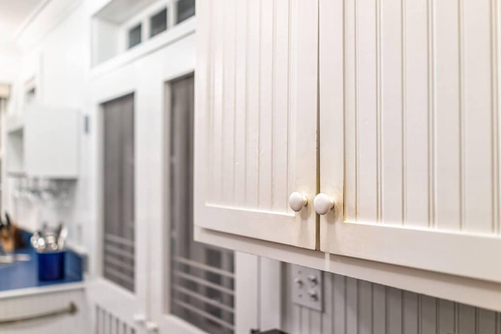
A crisp white cabinet paired with warm butcher block counters or natural oak trim creates a classic, timeless kitchen. This combination feels bright, clean, and grounded, especially with matte black or brass hardware. The white enhances the vertical lines of the beadboard, while the wood tones add warmth and a cozy farmhouse feel.
This palette works beautifully in farmhouse, cottagecore, or traditional homes.
Pair it with sleek lighting and minimal décor in more modern spaces to feel updated yet familiar.
Consider adding open shelving or natural fiber accents for any style to tie the look together. Because of its wide popularity, it’s easy to clean and has a strong resale appeal.
Soft gray beadboard with white countertops
Soft gray tones offer a touch of sophistication without making the space feel heavy. Pairing this shade with white quartz counters and black fixtures creates a cozy, modern farmhouse look that never feels overdone. Gray is less prone to showing dirt than white, which makes it a practical choice for busy households.
This color pairing suits transitional, contemporary, and Scandinavian-style homes. Its neutral base makes it easy to layer in different textures and finishes. To adopt this look for different styles, add accent colors like navy, sage, or metallics for the hardware and décor. This versatile combo balances trendiness and timelessness, giving you long-lasting appeal.
Cream or taupe beadboard with beige tile
Creamy, warm-toned cabinets combined with beige or stone backsplash tiles give off a soft and welcoming vibe. Brushed nickel or bronze fixtures complete the look while keeping things calm and cohesive. This palette works especially well in kitchens with a relaxed, rustic, or traditional feel.
It’s ideal for Mediterranean, French country, or classic home styles.
To make this combination feel up-to-date, add clean lines in the lighting or hardware or incorporate glass-front cabinet doors. The earthy tones create a timeless foundation that can be easily customized.
Bold and dramatic beadboard cabinet pairings

Navy or forest green with gold hardware
Deep greens or navy blues bring a richness to your space that works well with the detail of beadboard cabinets. Adding gold or copper hardware enhances the color and makes the overall design feel bold and upscale.
These tones are a great choice for large kitchens or open layouts, where they create a grounding focal point. This dramatic pairing suits colonial, mid-century modern, and modern traditional homes.
To make it work in other spaces, balance the rich hues with soft lighting, neutral walls, or light wood floors. The bold color and warm metals create a sophisticated atmosphere. Despite their richness, these shades are surprisingly adaptable when paired with simple layouts.
Black beadboard with marble countertops
For a modern, high-contrast look, black beadboard pairs beautifully with marble or quartz featuring subtle gray veining. This combination adds drama without sacrificing elegance and looks sharp with sleek finishes. It’s ideal for contemporary kitchens where you want both texture and minimalism to work together.
This look fits well in industrial, minimalist, or urban loft interiors. To make it work in more traditional homes, add warm lighting, natural materials, or soft textiles to create contrast and comfort. Black beadboard cabinets hide scuffs and fingerprints well, making them as practical as they are stylish.
Charcoal gray with white walls
Dark gray cabinets create depth in your kitchen, while white walls and light counters keep the space from feeling too enclosed. Bronze or black hardware helps tie everything together in a balanced, cohesive design. This palette also hides smudges well, making it a low-maintenance choice ideal for homes with families or pets.
This versatile scheme suits modern craftsman, transitional, and contemporary homes. Soften the look with pastel accents or rustic wood finishes to fit more casual or traditional styles. The contrast between dark cabinets and bright surroundings makes the kitchen feel crisp. Charcoal gray strikes a balance between drama and longevity.
Two-tone and mixed-material looks
White uppers and sage or navy lowers
Using a lighter color on upper cabinets and a deeper shade like sage green or navy on the lowers helps open up the kitchen visually while adding color below. This split design keeps the room airy without feeling flat. It’s also a great way to try bold colors without committing to them everywhere.
This combo pairs well with coastal, cottage, and transitional homes.
For more contemporary spaces, use flat-front cabinet doors and matte finishes. In traditional or farmhouse homes, consider beadboard details on the lower and open shelving above to highlight the contrast.
Wood-stained beadboard bases with painted uppers
A natural wood stain on lower cabinets brings warmth and character, especially when paired with simple white or cream uppers. The result is a clean yet organic look that feels grounded and intentional. This style is particularly effective in rustic, transitional, or Scandinavian-inspired kitchens.
It works beautifully in homes with natural or earthy design elements, like craftsman, mountain, or boho interiors. Choose lighter stains and minimalist hardware to tailor this look to modern styles. Opt for warm woods and classic pulls in more traditional homes to enhance their timeless feel.
Beadboard island with smooth perimeter cabinets
Try placing beadboard cabinets only on the island, using flat-panel or shaker doors on the surrounding walls. This mix of textures creates visual interest and makes the island feel like a custom-designed focal point. It also lets you experiment with color and material combinations.
This layout suits nearly every style — from modern farmhouse to coastal, transitional, or eclectic kitchens. Match the island color to design accents like lighting or textiles for a coordinated look. To create variety, you can reverse the scheme with a smooth island and beadboard perimeter.
Tips for choosing the right palette for your kitchen
Before committing to a cabinet color, consider your long-term plans. While bold colors may be fun now, soft neutrals often age more gracefully. The right color pairing will help your bespoke cabinetry feel timeless instead of trendy.
Here are some tips to help you decide:
1. Consider your lighting
Lighting has a huge impact on how cabinet colors look in your home. According to HGTV, natural daylight shows color in its truest form, while incandescent light adds warm, yellow tones, and fluorescents cast cool blue tones onto the colors.
This means natural light enhances brightness and clarity, making light tones appear even more airy and spacious. On the other hand, artificial light — especially warm or cool LED bulbs — shifts color undertones throughout the day.
Before you finalize a cabinet color, use swatches or physical samples and observe how they appear in your kitchen under different lighting conditions.
2. Coordinate with fixed elements
Your cabinetry won’t exist in a vacuum; flooring, countertops, backsplash tiles, and appliance finishes all contribute to your kitchen’s visual harmony.
Make sure your color choices complement these permanent fixtures. For example, warm cabinets look great with wood or earth-toned tiles, while cooler tones might work better with stainless steel or gray stone surfaces. Custom-built cabinets give you more flexibility to fine-tune tones for coordination.
3. Match your home’s architecture
Your home’s architectural style should help guide your palette. Classic styles, like farmhouse, coastal, or colonial, pair well with soft neutrals, whites, and natural stains. Modern homes often call for bolder hues, deeper contrasts, or flat finishes.
If your house blends different aesthetics, use a timeless base color and layer in accents. Bespoke cabinetry makes it easy to tailor finishes that honor your home’s identity.
4. Think long-term functionality
Your kitchen should look good while supporting your daily life. If you cook often, entertain guests, or have pets and children, opt for durable and easy-to-maintain finishes. Darker tones hide smudges and stains, while mid-tone neutrals like taupe and greige offer a forgiving surface that still feels elevated.
Trendy colors might tempt you, but timeless hues like cream, gray, or soft green stay stylish longer.
5. Design for flexibility
Color is a strong visual anchor or a subtle backdrop. When designing your palette, consider how often you like updating your décor. Neutral cabinet colors offer a flexible foundation, allowing you to swap hardware, wall paint, or accessories without clashing.
Consider applying bold hues to smaller areas like an island or open shelving to experiment with color.
Whatever you decide, design a color scheme that feels true to your home and lifestyle. From lighting and layout to mood and maintenance, a thoughtful palette ensures your cabinets look beautiful.
Get custom options from Utah Express Cabinets
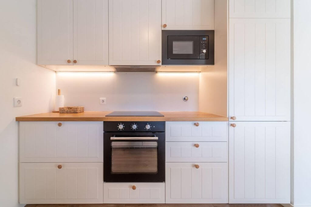
Whether you want soft neutrals, rich jewel tones, or a mix of both, Utah Express Cabinets will help bring your vision to life. We specialize in custom-built cabinets that fit your space, style, and budget.
Our team offers expert artistry and quick turnarounds, from initial design to install-ready bespoke cabinetry. We’ll help you choose colors, finishes, and combinations that work in your home.
Explore the possibilities at utahexpresscabinets.com or contact us for a complimentary estimate. With Utah Express Cabinets, your dream cabinets are closer than you think.