Two-tone cabinets are one of the most effective ways to add personality to your kitchen without a full remodel. By mixing colors, textures, or finishes, you create instant contrast, making your cabinetry feel more layered, intentional, and uniquely you.
Whether you’re after a bold statement or a soft blend of tones, this design approach works with nearly any style, from modern to rustic.
If you’re looking for painting kitchen cupboard ideas or debating whether to opt for light or dark, two-tone cabinetry offers a wider range of options.
In this blog, we’ll explore how to make the most of this style and showcase it in your space.

What are two-tone cabinets?
Two-tone kitchen cabinets are a simple yet modern way to make your space feel more exciting, according to The Spruce.
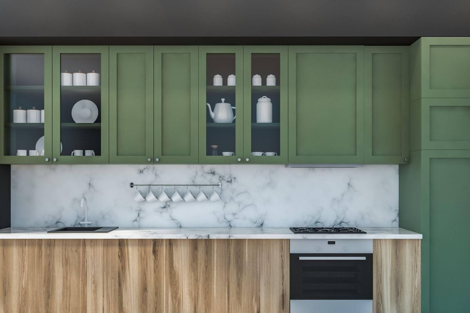
Two-tone cabinets feature two different colors or finishes within the same kitchen layout. Most often, the paint on the upper and lower cabinets features contrasting tones, such as white uppers paired with navy or wood-stained lowers. The design can also apply to islands, pantry units, or the interior and exterior of cabinet doors.
This approach adds visual movement and personality to a space that might otherwise feel flat. For example, a dark lower cabinet base grounds the kitchen while light uppers keep things open and airy. It’s one of the easiest ways to incorporate customizable kitchen cabinets into your design. You choose the exact balance of color and material that fits your aesthetic.
More than a trend, this idea also has lasting flexibility. You can adapt it to fit modern minimalism, farmhouse charm, transitional warmth, or even industrial edge. Two-tone cabinetry is one of the most adaptable painting kitchen cupboard ideas, offering a way to express your style without overwhelming the space.
Why two-tone cabinets work
Two-tone cabinets are visually striking while they serve aesthetic and practical purposes. With the right color pairing and placement, this approach will reshape the feel of your kitchen and improve the flow of your design.
Create depth and dimension
A uniform wall of cabinetry may feel flat, especially in smaller kitchens. Two-tone combinations break up the visual space, adding depth and creating natural focal points. Contrasting upper and lower cabinets, or pairing a bold island with softer wall units, keeps the eye moving and adds layers of interest to the room.
This is effective when paired with customizable kitchen cabinets, as you can fine-tune proportions, finishes, and placement to ensure the contrast enhances rather than overwhelms.
Define zones
In open-concept kitchens, two-tone designs provide a subtle way to distinguish between different areas, such as prep, cooking, or entertaining zones. A darker set of cabinets beneath a breakfast bar visually separates it from the cooking space, while a lighter shade around the sink or window helps that area feel more open.
This kind of intentional zoning brings structure to your layout and helps make small spaces feel more organized and purposeful.
Offer flexibility for style expression
Two-tone cabinets allow you to be bold without committing to a fully dramatic design. Would you like to test navy blue or forest green? Apply it to your lowers and keep the uppers white or cream to maintain balance. Want to mix wood tones and painted finishes? This approach gives you room to experiment.
That’s why this trend pairs well with experimentation — you can embrace color, texture, or contrast in measured ways that still make a big impact.

The evolution of the two-tone trend
Two-tone cabinets may feel like a modern trend, but their roots go back decades. In traditional European kitchens, painted upper cabinets and natural wood lowers were a common way to blend function with charm.
This look evolved over time into a hallmark of farmhouse, cottage, and even Art Deco designs, where bold color play and custom millwork set each kitchen apart.
Today, two-tone cabinets have become a go-to choice for designers. The rise of open-concept layouts, mixed materials, and homeowner personalization all contributed to this look taking center stage. People want spaces that reflect their personality, and two-tone designs are one of the simplest ways to achieve this.
Modern trends have expanded the range of possibilities, incorporating everything from high-contrast palettes to tone-on-tone minimalism. Whether you’re looking for drama or softness, there’s a two-tone combo that brings balance, function, and creativity into your kitchen.

Choosing the right color combinations
When planning customizable kitchen cabinets with a two-tone design, the color selection will significantly impact the overall feel and dynamic of your cabinets. You want shades that balance contrast with cohesion, colors that define your space while still working together.
Whether you prefer subtle shifts or bold statements, the combinations below offer a great starting point.
Classic white and navy blue
A timeless favorite, this combo creates elegant contrast. White uppers reflect light, keeping the space feeling open, while navy lowers add richness and depth. Brass or gold hardware ties everything together for a polished finish.
This is one of the most popular pairings for painting kitchen cupboard ideas because it matches a range of styles, from traditional to coastal and even modern farmhouse.
Warm wood with soft gray
If you prefer a more natural look, consider pairing wood-toned lowers (such as walnut, hickory, or oak) with soft gray uppers. This combination adds warmth and keeps things grounded, while the gray brings in a calming, contemporary feel.
It’s especially effective when you have the ability to fully customize your kitchen cabinets. You can adjust stain levels, grain direction, and door style to get the perfect blend of modern and rustic.
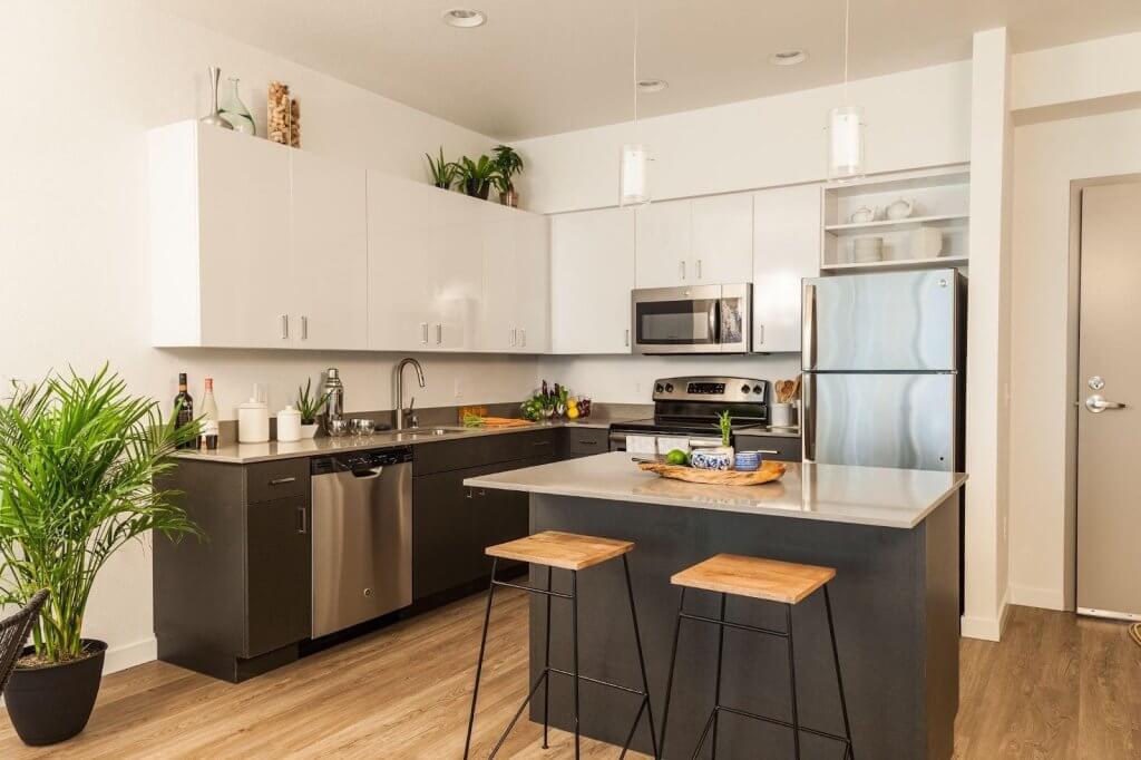
Black and white for modern contrast
Black lowers and white uppers deliver high impact with clean lines. This minimalist duo works well in contemporary or industrial kitchens, where you want sharp definition and simplicity.
Elevate flat-panel doors in this palette with sleek hardware, integrated lighting, or contrasting countertop materials. Many homeowners love this option when exploring two-tone cabinets because it feels crisp without being cold.
Sage green and cream
For a softer and more inviting look, sage green paired with creamy white or off-white adds subtle color without overwhelming the space. This combination evokes a cottage-style or country-inspired kitchen and looks beautiful with wood accents and vintage hardware.
It’s a great match for homes looking to incorporate painting kitchen cupboard ideas that are earthy, relaxing, and timeless.
Charcoal and light wood
Want something dramatic yet balanced? Try charcoal gray uppers with light wood lowers. The dark top cabinets draw the eye upward, while the natural wood keeps the space warm and approachable.
This is a flexible combination that allows you to experiment with texture and sheen, as well as paint colors.
Bold contrast for dramatic impact
Pairing black and white creates a striking, high-contrast look that’s perfect for modern or transitional kitchens. This combo emphasizes clean lines and works well with metallic hardware and sleek countertops.
Natural tones for warmth and texture
Combine rich wood tones on your lower cabinets with soft cream or off-white uppers. This balance brings depth and warmth — perfect for farmhouse or Scandinavian-inspired spaces. Wood grounds the design, while light uppers keep it open and airy.
Blue and white for a coastal feel
A timeless pairing, navy or powder blue lowers with crisp white uppers evoke calm, breezy charm. This combo reflects natural light beautifully and feels fresh without overwhelming the space.
Muted neutrals for a minimalist aesthetic
Think sage green with soft beige or charcoal paired with taupe. These tone-on-tone combinations are understated and sophisticated — ideal for minimalist kitchens or those with natural materials like concrete or slate.
Blush and walnut for a hint of romance
Blush pink uppers with dark walnut lowers create a warm and unexpected twist. This pairing is ideal for cottagecore or eclectic kitchens that lean into personality while maintaining a balanced feel.
These color combinations work across different styles and kitchen layouts, especially when implemented with customizable kitchen cabinets that allow you to adjust everything from finish to frame.
HGTV offers plenty of additional design inspiration options if you are still looking for your perfect two-tone combo.
Where to apply the two-tone look in your layout
Once you’ve chosen your color palette, it’s time to think about how and where to apply it. The success of two-tone cabinets comes down to placement; it should feel intentional, not accidental. Here’s how to make it work throughout your kitchen layout.
Upper and lower contrast
The most common approach to two-tone cabinets is to use one color for the upper cabinets and another for the lower. This layout draws the eye around the room and helps anchor your space. Typically, the darker tone works better at the bottom to ground the design, while lighter colors in the uppers keep the space feeling open and bright.
This technique is particularly effective in smaller kitchens where visual weight needs careful management. Choosing everything from door style to finish texture to suit this split look is best done with customizable kitchen cabinets.
Island as a color accent
Your kitchen island is the perfect spot to introduce a second color. If your perimeter cabinets are all one shade, use the island to make a bold statement. Navy, black, or deep green islands paired with white or neutral cabinetry create visual interest without overwhelming the space.
This is a great solution for those testing out kitchen cupboard ideas to get a taste of color without a full commitment.
Wall cabinets vs. base cabinets
Another subtle two-tone application is to separate colors by cabinet type rather than location. For example, use one color for all wall-mounted storage (like vertical pantry cabinets or upper shelving) and another for drawers and lower cabinets.
This works well when you mix inset doors on the uppers with flat-panel drawers on the base; the color shift reinforces the visual break.
Color blocking for built-ins
For kitchens with floor-to-ceiling built-ins or appliance garages, consider color blocking. Assign one cohesive shade to a full-height cabinet wall and use a different one for the working areas, such as prep stations or sinks. This creates zones of interest while maintaining a cohesive look.
Homeowners often explore this layout when planning how to help break up large spaces without relying on upper and lower contrast.

Styling and finishing tips for a cohesive look
Using two-tone cabinets is about more than choosing two colors — the finishing details tie the whole design together. A thoughtful approach to hardware, finishes, and layout makes your cabinets feel custom and complete.
Here’s how to bring it all together with style and balance.
Match your hardware and finishes
When mixing colors, it helps to maintain consistency across all cabinetry. Matching pulls and knobs in a unified finish, like matte black, brushed brass, or polished chrome, brings harmony to contrasting cabinet tones. You may want to coordinate with lighting fixtures, faucets, or appliances for a well-rounded palette.
If you’re exploring painting kitchen cupboard ideas, remember that the hardware finish helps ground or elevate your color selections.
Use countertops and backsplashes to balance
Neutral countertops (like white quartz, butcher block, or subtle stone patterns) act as a bridge between your two cabinet tones. They prevent the space from feeling disjointed and allow your cabinetry colors to shine.
Backsplashes also play a visual role. If your cabinet colors are bold or high-contrast, a soft subway tile or beadboard panel will create a clean backdrop that softens the transition between tones.
Add consistent trim and molding
To keep your customizable kitchen cabinets feeling cohesive, use matching crown molding, toe kicks, or trim. These subtle architectural elements visually tie the upper and lower cabinetry together, especially when you use contrasting colors.
Even small additions, such as matching filler strips or painted end panels, will enhance the flow and give your kitchen a built-in, polished appearance.
Keep visual weight balanced
A two-tone look works best when the overall design feels stable. Avoid putting the darker color in high-up, small, or narrow sections. Instead, place darker tones lower to the ground, in base cabinets or an island, to create a sense of grounding. Lighter shades on top keep the space from feeling top-heavy.
Always aim for proportional balance.
Get custom options from Utah Express Cabinets
Two-tone cabinets are a powerful way to express personality, style, and function in your kitchen, but the real magic happens when you design them yourself with a trusted team. With customizable kitchen cabinets from Utah Express Cabinets, you’re not limited to off-the-shelf solutions. You get cabinetry that fits your space, your taste, and your lifestyle.
Whether you want bold contrast, soft neutrals, or a balance of both, we’ll help you explore color combinations, finishes, hardware, and layouts that bring your vision to life. Our team provides quick turnarounds, expert guidance, and personalized service from design to installation.
Visit utahexpresscabinets.com to start planning your perfect two-tone cabinet design today.